

 See My Latest Article on HelloNation
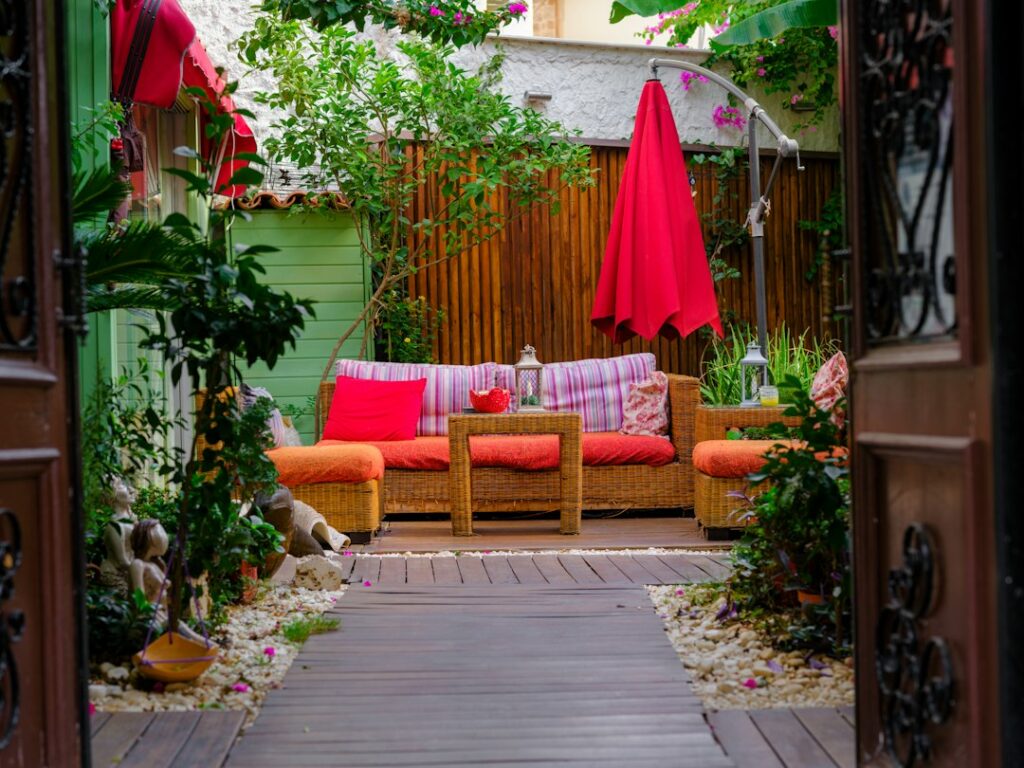
Outdoor color affects how a patio, porch, deck, or garden feels long before anyone notices individual furniture pieces. The right combination can make a space feel cooler, more open, connected to the landscape, or ready for relaxed gatherings. In Lexington, SC, color planning also needs to account for strong sunlight, humid summers, seasonal pollen, and outdoor materials that may weather differently over time.
How should a color scheme begin?
Start with the fixed colors that are already present rather than choosing accessories first. Paving, brick, siding, roofing, fencing, mature trees, and the surrounding landscape create the visual background for everything added later.
A simple outdoor color plan usually includes:
- A dominant color for large surfaces or structures
- A supporting color for furniture, containers, or architectural details
- One or two accent colors for cushions, pottery, flowers, or decorative objects
The dominant color should usually be quiet and adaptable. Warm gray, muted tan, clay, soft green, and weathered brown tend to work well with natural surroundings. Supporting colors can add more personality without making the entire space feel busy.
Before purchasing anything, observe the area at different times of day. A color that looks balanced in morning shade may appear much brighter in direct afternoon sun. Samples should be viewed beside existing surfaces and, if possible, outdoors rather than under indoor lighting.
Which colors work well in strong sunlight?
Sunlight increases the visual intensity of many colors. Bright white can produce glare, while highly saturated red, orange, or yellow may appear more vivid than expected. Mid-tone colors and softened versions of brighter hues are often easier to live with in exposed areas.
For sunny outdoor rooms, consider:
- Soft cream instead of stark white
- Terracotta or muted rust instead of bright orange
- Sage or olive instead of intense green
- Dusty blue instead of highly saturated blue
- Charcoal or deep brown as an accent rather than the main surface color
Dark colors can provide useful contrast, but they also absorb more heat and may become uncomfortable to touch. This matters for metal furniture, dark pavers, railings, and other surfaces exposed to direct summer sun.
Color should be considered alongside shade. A pergola, canopy, umbrella, or leafy planting area changes how colors are perceived and can make richer tones more comfortable.
How can color make a small outdoor space feel larger?
Light, low-contrast colors generally make a compact area feel more open, especially when the floor, walls, and furniture are visually related. Using too many sharply contrasting colors can divide the space into small visual sections.
A small patio or balcony may benefit from:
- A limited palette of two or three related colors
- Furniture that blends with the surrounding surface
- Light-colored walls or screens where glare is manageable
- Repeated colors in cushions, planters, and nearby planting
- Vertical accents that draw the eye upward
This does not mean every item should match. Variation in texture can create interest without adding another color. For example, a neutral paver, woven chair, painted planter, and leafy plant may feel layered even when they share a restrained palette.
Mirrored or glossy surfaces should be used carefully. They can reflect light and make a small area feel brighter, but they may also create glare or show pollen and water spots more clearly.
How does color affect outdoor comfort?
Color influences mood, perceived temperature, and how welcoming a space feels. Cool greens, blue-grays, and muted blues often suggest shade and calm. Warm browns, ochres, and terracotta tones create a grounded feeling and pair naturally with wood, masonry, and planting.
The purpose of the space should guide the palette:
- Dining areas can use warm, moderate colors that encourage conversation.
- Reading or resting areas often work well with softer greens, blues, and natural neutrals.
- Activity areas may include brighter accents that are easy to identify.
- Entry paths and steps benefit from clear contrast for visibility.
Color contrast also has a practical safety role. Steps, edges, railings, and changes in elevation should be easy to distinguish, particularly in evening light or for people with reduced vision. A subtle decorative palette should not come at the expense of visibility.
How should plants be included in the color plan?
Plants are not just background greenery; they are one of the largest sources of changing color outdoors. Foliage may range from blue-green to yellow-green, while flowers and seasonal leaves introduce temporary accents.
A reliable approach is to treat foliage as a long-term color layer and flowers as seasonal highlights. This keeps the space visually stable even when blooms fade.
Consider the following:

- Match warm-toned flowers with clay, bronze, tan, or brown surfaces.
- Pair blue-green foliage with gray, cream, or weathered wood.
- Use bright flowers sparingly when the surrounding hardscape is already colorful.
- Repeat a plant color in more than one location so it feels intentional.
- Account for seasonal changes rather than planning only for peak bloom.
In the local climate, heat, humidity, storms, and pollen can influence which colors remain attractive. Light-colored surfaces may show pollen and soil more quickly, while very dark surfaces can reveal dust, water marks, and fading. The most practical choice depends on maintenance habits as much as appearance.
Should outdoor furniture match the house?
Furniture does not need to match the house exactly. It should relate to the home through color, material, or visual weight.
For example, a warm-toned home may work with olive cushions, natural wood, or muted charcoal furniture. A home with cooler gray or blue elements may coordinate with soft green, slate, or weathered metal tones. The goal is connection rather than exact repetition.
Repeating one house color in small outdoor details can create continuity. A trim color might appear in a cushion pattern, planter, gate, or lantern. This technique is usually more effective than adding many unrelated colors.
If the house already has strong visual character, a quieter outdoor palette can prevent competition. If the architecture is simple, color can be introduced through textiles, containers, planting, and artwork that can be changed over time.
What color mistakes are common in outdoor design?
The most common problem is choosing colors independently instead of considering the entire view. A patio may look attractive by itself but feel disconnected from the house, yard, or adjacent structures.
Other frequent mistakes include:
- Using too many accent colors without a unifying neutral
- Choosing colors from an indoor sample without testing them outside
- Ignoring how direct sun changes brightness
- Selecting dark materials for areas that receive intense heat
- Matching every item so closely that the space lacks contrast
- Forgetting that plants and seasonal conditions add changing color
- Placing bright colors where they create glare or visual distraction
Another misconception is that neutral means colorless. Natural stone, wood, soil, foliage, and masonry often contain several subtle tones. A neutral palette can be rich when it combines different textures and undertones.
How can color be tested before making permanent changes?
Use temporary samples before committing to paint, large furnishings, paving, or built-in elements. Place fabric swatches, painted boards, planters, or paper samples in the actual setting and view them in sun, shade, and evening conditions.
Check the colors from inside the house as well as from the yard. Outdoor areas are often seen through windows, doors, or screened openings, so the palette should look compatible from both directions.
A useful test is to photograph the space at several times of day. Photos can reveal excessive contrast, glare, or colors that disappear against the background. It also helps to view the area from the main seating position, dining location, and approach path.
A successful outdoor color plan does not require a large number of colors. It requires a clear relationship between the home, hardscape, planting, furniture, and light. A restrained foundation with a few intentional accents usually remains comfortable through changing seasons and easier to update as outdoor habits evolve.